

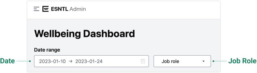
You may notice data visualizations that say “Not enough data” or have gaps between data points. This is because data points are hidden when they don’t make up a large enough aggregate of users to ensure data anonymization. Organizations with more users are less likely to see this. To ensure this data anonymization the following rules are used:
Data points representing <5 users are excluded from most visualizations and calculations.
Elevated heart rate horizontal bar chart values of 1-3 are represented as “≤ 3”.
Weekly active devices data points representing <5 unique devices are excluded.
Dates where there were <5 active unique mobile devices are excluded from Wellness resource usage data.
Critical Interventions is the only chart that doesn’t have a minimum count requirement.
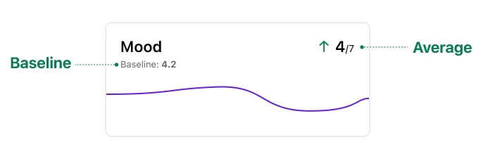
Baseline: Average of data points for the 5 years preceding the date range selected where the data points represent 5 or more users.
Average: Average of the data points for the date range selected where data points represent 5 or more users.
| Data point | Description | Source |
| Mood | Average of all mood ratings | · Start of day checkin · End of day checkin |
| Sleep Time | Average of all recorded sleep time amounts | Passively collected from Watch |
| Exercise Mins | Average of all recorded exercise minutes | Passively collected from Watch |
| Nutrition Satisfaction | Average of all recorded nutrition satisfaction responses | End of day checkin |
| Sleep Quality Score | Average of all recorded sleep quality responses | Start of day checkin |
| Hydration Amount | Average of all recorded hydration score responses | End of day checkin |
| Work/Life Balance | Average of all recorded work/life balance responses Note: Work/Life balance is asked in the app once per week. When a user responds to the question, that value is applied to current date and preceding 6 days | End of day checkin |
| Exercise Satisfaction | Average of all recorded exercise satisfaction responses. | End of day checkin |
| Social Connection | Average of all social connection responses. Note: Social Connection is asked in the app once per week. When a user responds to the question, that value is applied to current date and preceding 6 days | End of day checkin |
| Resting Heart Rate | Average of all recorded resting heart rates | Passively collected from Watch |
| Elevated Heart Rate Events | Average number instances per user where resting heart rate was 70% above resting | End of day checkin |
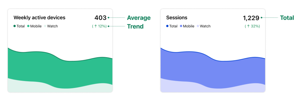
Average: Average of the data points for the date range selected where data points represent 5 or more users.
Total: Sum of the values for the data points in the date range selected where data points represent 5 or more users.
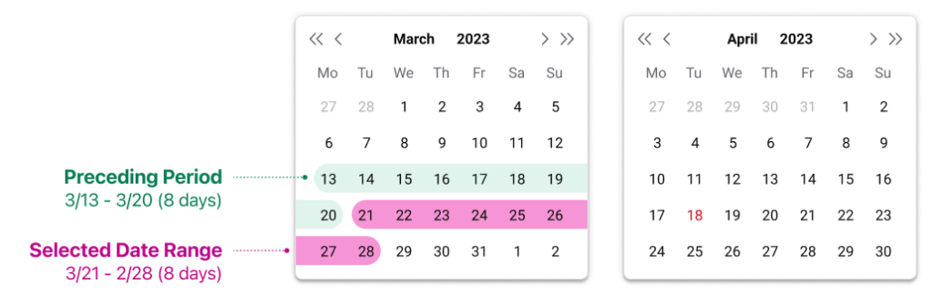
Trend: The percentage difference between the total or average for the currently selected date range and the previous period.
| Data point | Description | Statistic |
| Weekly active devices | Mobile: Number of phones with at least one session in the week starting on the given data point. Watches: Number of watches that gathered biometric data in the week starting on the given data point. Total: Combined total of weekly active mobile and watch devices for the week starting on the given data point. | Average |
| Weekly sessions | Total number of sessions across both phone and watch devices for the week beginning on date displayed. | Average |
| Critical Interventions | Number of clicks of emergency resources | Total |
| Daily active users | Number of users that had at least one session | Average |
| Wearers to bed | Number of users that had sleep time data Watch users (modal window): Number of users that had resting heart rate data | Average |
| Daily sessions / user | Sessions per user per day | Average |
| Median session length | For each date, the median session length is calculated for each job role and the average of those medians is displayed. | Average |
| SOD check-ins | Number of start of day check-ins within the date range selected | Total |
| EOD check-ins | Number of start of day check-ins within the date range selected | Total |